Design Trends That Came Out of the Knowledge Base: How to Know If Something Is Vibecoded
Michael - 2025
Because LLMs have knowledge bases that are — for brevity — trained on whatever they can get their hands on, we end up with a homogenous machine that merges everything toward a middle line.
When it comes to generating visuals, we see this convergence in two ways: AI image generation, and code generation viewed through its interface.
The Image Generation Tell
You can see this in motion when you get AI to action something. A general prompt for an image, and you get a cartoony-real-ish-centered-gender-ambiguous-racially-ambiguous happy family that reaches a diversity quota across it even if it looks like the kids maybe had different dads.
For image generation, this is less of a problem. We kinda have the words for this already. There's a whole bunch of ways you can explain art. Impressionist. Surrealist. Cubist. I've run out. You understand my point.
The Interface Generation Tell
When it comes to interface design, unless you have some design experience, a beginner might find it hard to do much more than "make it look better."
This is why one of the first tips I'd tell people is to go and learn the design words. Identify those words in real design, so you can see a dashboard as a sum of its parts. I give some important ones for me a bit later.
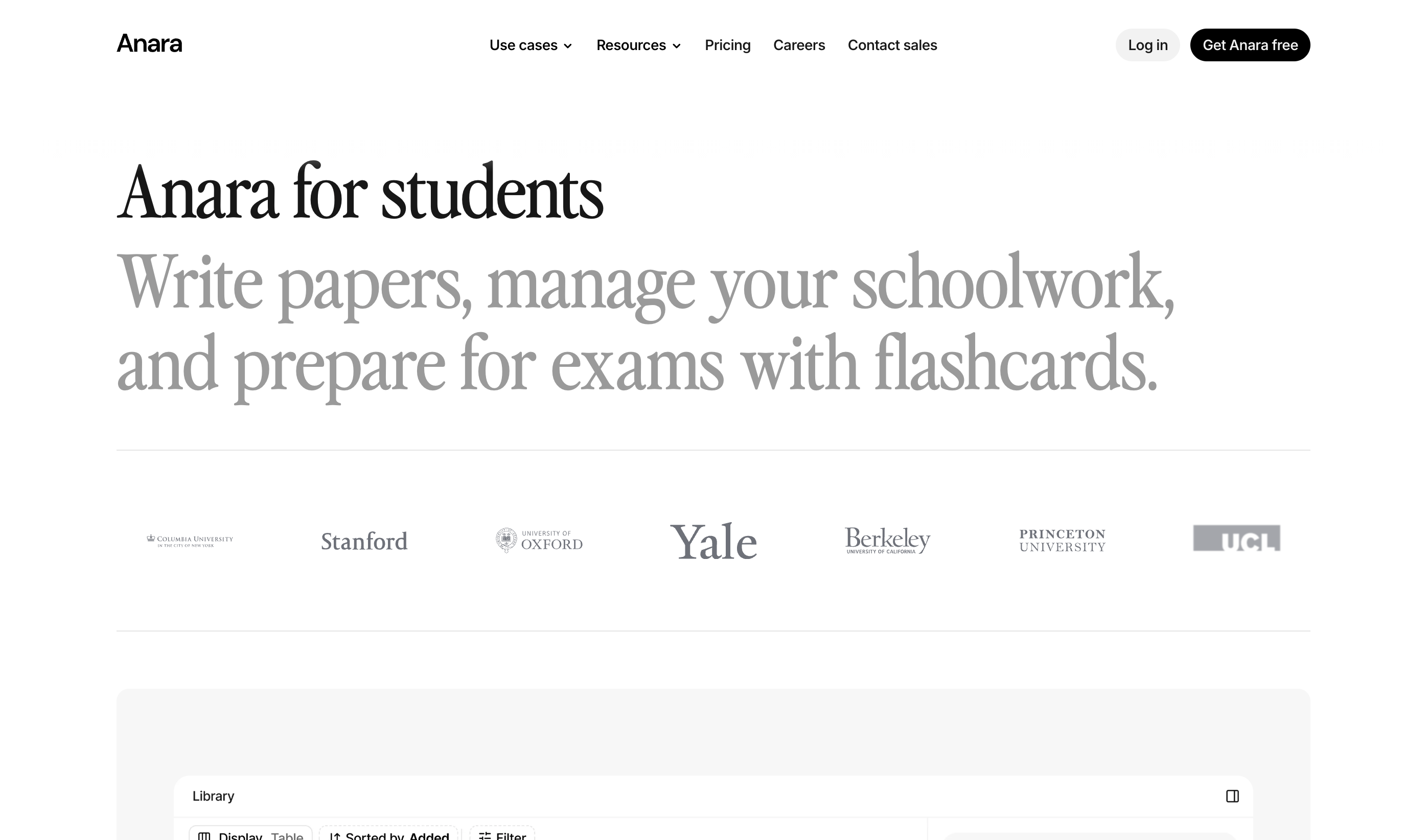
Take FlightQueue, an airport wait time dashboard. I think its actually a pretty neat app. But importantly here, it's a pretty fair example of what AI-generated interfaces or dashboards specifically look like right now.
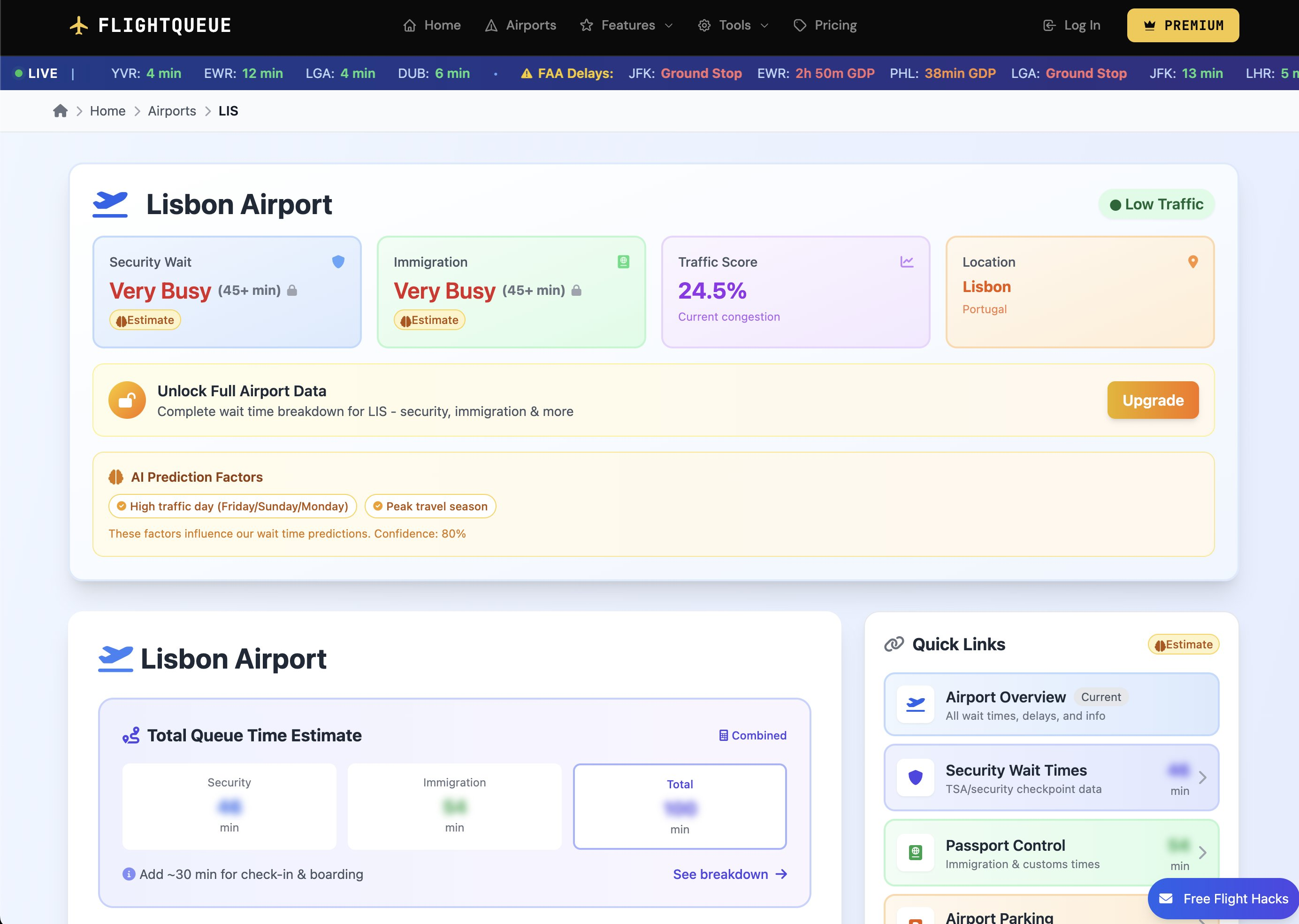
You can see the four data oblongs. Security Wait. Immigration. Traffic Score. Location. AI, for some reason, has a nasty habit of coding all datapoints into the dashboard, and forcing there to be four big bold metrics in equidistant oblongs at the top. Although in this example you can see the merit in them more than most, these are almost exclusively just useless.
I've even had AI put "Average Time Elapsed", "Average tokens", "API cost" in these boxes for one of my AI pipelines — absolutely useless for a user, maybe useful for a dev on the product.
A design team would almost instantly hide this information, but the coder might think "oh, 'Avg. Time Elapsed' is there—why not keep it?" Especially if you're new to this, it almost seems like you've done more or can do more. This individual can calculate the current congestion percentage! I think a design team would just give you the wait time for example.
Unfortunately, most of "taste"—that intangible quality that people seem to be betting on being the final commoditisable hard skill—at the moment, is stripping back the fluff.
The Tells
Beyond the four metric oblongs, the vibecoded interface has other signatures:
The purple gradient. AI tools have a love affair with purple-to-blue. "Make this look good", "Make this look proffessional" = "Add big purple gradient".
Inter font, everywhere. Inter is excellent—designed specifically for screen legibility. But it's become the vibecoded default. Every v0 output, every Cursor prototype. It's not wrong but its not chosen. I think flight queue actually uses a sans-serif for the text but its not far off.
Everything floats and glows. Soft shadows, rounded corners. Elements hover above backgrounds. Their sub elements hover above the parent too. Nothing sits flat. I spend an awful lot of time typing "let it sit flat on the page".
Emoji as interface element. AI loves emoji because it appeared in countless component libraries and Notion-style interfaces.
The same icons. Lucide, Heroicons, the same pictograms in the same places.
Can AI Learn Taste?
What I find actually quite philosophical is whether taste is safe. Recent models have come out with specific marketing about getting better at design. OpenAI's GPT-5 launch specifically noted improvements in frontend generation, claiming the model "can often create beautiful and responsive websites, apps, and games with an eye for aesthetic sensibility." Early testers praised "its design choices, with a much better understanding of things like spacing, typography, and white space." Vercel called it "the best frontend AI model, hitting top performance across both the aesthetic sense and the code quality."
They got designers on the team to evaluate outputs. They iteratively improved it — probably through reinforcement learning, probably by including better design in the datasets, probably by having humans tag outputs as good or bad.
They're actively training it to know what's good. Taste can probably be made formulaic.
Idea + different idea = new idea
Tagging outputs as generally liked versus not generally liked is possible. It's less of this unrepeatable human quality than we'd like to think.
But there are inherent problems with this from an LLM perspective.
The model can't agentically choose a direction. It's about picking your design system, that's coherent across itself. An AI will homogenise into the middle line unless it's pre-processed and pre-prompted to randomly choose a design system style that's consistent. But then it also needs to know the consistent design systems of this era—and they're changing all the time. The training data is an inhibitor. It's one or two years behind at best.
This is partly mechanical (it takes time to train and deploy) and partly fundamental (taste is partly about differentiation, and a model trained on what was common will reproduce what was common).
The Time Lag
The beautiful thing is that design trends ebb and flow like fashion cycles. And what's in the LLM is notably and inherently at best 1-2 years behind, often more.
We've seen a massive trend in companies using serif fonts over sleek minimalist sans-serifs — your Inter fonts. Monotype's 2024 type trend report explicitly calls out the return of serifs after years of minimalist sans-serif dominance. Creative Boom notes "a resurgence of elegant serifs."
This is partly because, like fashion, sleek minimalism was overdone. But I wonder how much is to do with the fact that it makes it look less vibecoded. It makes it feel chosen, purposeful, and I guess importantly — look alright.
The Signal Problem
The problem with the FlightQueue example isn't that it's bad. It functions. But the signal is pretty inescapable that if the interface is vibecoded, what's behind it might be vibecoded too.
The author of FlightQueue probably did vibe code it, and probably isn't that ashamed of it. It's a perfectly reasonable way to ship a product quickly. But its not good design. It does send a signal about provenance that might matter for some products and not others.
For example, they are trying to commoditise the site. Imagine a design system that felt like Star Alliance, that made the user feel like they're apart of a premium club, or they are smarter, better, and more successful than the rest of the people they are in the queue with. For some reason I feel like marketing like that works in the Airline industry. Perhaps just telling people they could save time could be enough. Point being, this feeling isnt conveyed by the current interface, and I think its because it was done by AI we get none of that.
Design as Counter-Signal
I wonder if design trends will become the equal and opposite reaction to how AI codes interfaces. And I wonder if it already is.
What I mean is: how much will design trends be a result of subliminal signals that this was handmade rather than generated?
This is another reason I think complexity might come back into design.
We've seen this cycle play out once. The modern landing page got uber-complex for complexity's sake—massive 3D objects made in Blender, positional lighting that moved as you scrolled. I guess signalling we can develop this and our neighbour can't. Massive spinning structures with dynamic lighting.
The irony is we learnt that was actually bad for conversion. But maybe OK for branding, depending on who you are.
Then for conversion's sake we saw the super simple landing page. Spoke straight to you instantly. Reduced unnecessary friction. We've got e-commerce down to a real science now.
As it stands today, these models can't do massive floating, spinning 3D structures with dynamic lighting in React. They can't do the complex WebGL stuff. Maybe that signalling will become important again — until they can do it. And then we'll go back to simple.
The Cycle
If I had to guess, design will trend like this:
Simple (2010) — I'm learning HTML.
Complex (2018) — Look at what we can do that our competitor can't. The inception of digital branding, and people getting a bit over excited.
Simple (2023) — We've got e-commerce down to a real science now.
Complex (2026?) — AI can't do this. We're a luxury product, both front and back.
Simple (2028?) — AI can do this now. What's the point? Here's my product, buy it or don't. I'm on UBI anyway.
The Nuance
Although it's not quite as simple as that.
There's genuine tension between what converts and what brands well. Crowded landing pages can actually convert much better, but look worse for a brand. The long-form sales page with more proof points outperforms the minimal hero for certain products.
Simple works for impulse. Complex works for consideration. And "complex" isn't the same as "cluttered" — there's complexity that demonstrates expertise and complexity that's just noise.
The FlightQueue dashboard isn't complex in the good way. It's not signalling expertise or craft. It's just everything the AI thought to include in AI's current signature style.
That's the distinction. Intentional complexity that demonstrates mastery versus autopilot complexity because the AI doesn't have the bottle to leave stuff out like a design team would.
Learn the Words
So here's the practical advice: learn the design words. See a dashboard as a sum of its parts.
Visual hierarchy — The arrangement of elements so your eye knows where to go first. If everything is the same size, nothing is important.
Whitespace — The empty area between elements. Vibecoded interfaces cram everything together. This is probably my favourite word. "Negative space" works too, I learnt that in GCSE Art. It's simply saying "put nothing here".
Typography hierarchy — Headlines, subheads, body copy, captions. Different sizes and weights create layers. What font you use for each and why, that's all important when making a design system generally. Speaking in H1, H2 will make you more efficient.
Grid system — The invisible structure that aligns elements.
Information architecture — How content is organised. What's grouped, what's separated, what's hidden behind a click.
Affordance — Whether an element looks interactive.
Once you have the words, you can see a dashboard not as a monolithic thing but as typography + hierarchy + whitespace + colour + information architecture. Then you can say what you actually want.
The AI will keep getting better at design. They're training it to have taste. I think they'll get there sooner than we think. But for now, the training data is behind, the model defaults to the middle, and the clearest signal that a human was here is still: this doesn't look like everything else.
Key references:
- GPT-5 Launch: Frontend & Aesthetic Improvements (OpenAI)
- GPT-5 for Developers: Vercel Quote (OpenAI)
- Why AI-Generated Designs Look the Same (Vandelay Design)
- Font Trends 2025: The Return of Serifs (Creative Boom)
- Serifs are In, Simplicity is Out (Fast Company / Monotype)
- Vibe Coding (Wikipedia)
- FlightQueue